AILERON
BRAND CAMPAIGN & EVENT PROMOTION
AILERON - Branding, Event Promotion and Digital Media for a “concept company”
Category: Corporate Identity, Advertising: Poster Design, Website
Project Description
Originally conceived as part of an assignment, Aileron is a fanciful company founded on the principles and design ethics of Buckminster Fuller, engineering and design visionary. The company as conceived manufactures ultra-light backcountry shelters, tents, and adventure gear. Committed (as Bucky Fuller was) to a global view that embraces the use of cutting edge technologies and a Green ethic, the Aileron company was a client seeking brand identity, collateral, and help in promoting an event screening. The project painted the portrait of Aileron through Branding, Corporate Identity, Event Promotion and Poster Design, and support media in the way of Homepage and Website design.
Target Audience
The audience is 18-49-year olds, men and women, and part of the new crowd of backcountry enthusiasts. The advent of backcountry skiing and split-boarding, a youthful audience that is seeking alternate adventures off of the beaten track.
Background
The company needed a Brand Identity, including Logo and Logotype that showed the heritage of the 1960s, when Buckminster Fuller’s geodesic domes entered the popular culture and he was embraced by the design if not the industrial segments of society in full. The famous “Earthrise”—a new, universal look back at Earth by the Apollo astronauts as their craft orbited the Moon—became the emblem of
a generation and an age. The rising-Earth crescent form was inspiration for the
logo design for Aileron, and is a nod to the cultural and chronological roots for
the company’s mission.
Design Problem
Logo and logotype as part of establishing the new brand: modern, Green, idealistic, athletic, and adventurous are their corporate watchwords. Create corporate identity package in keeping with company mission to serve young to middle-age backcountry enthusiasts, especially those who appreciate modern design and materials, and a thoughtfulness about environmental impact. Promotion campaigns will be supported through design of event poster for screenings of a promotional adventure documentary, one of a modern genre of adventure film or mountaineering screenings that are growing in popularity; creation of ads for social media , postcards for handouts, and other promotional support collateral
to assist with the product launch.
Design Process
Analyzing clean, sans-serif and modern typefaces, I designed a
logo based on the company’s mission and ethics: modernism,
clean environmentalism, upward mountain travel, adventure. For inspiration of the event poster, I studied Japanese and anime magazines, covers, and design, seeking an international feel and romanticism of the hills in the incorporation of illustration into the Art Deco design. Social media and website design were influenced by research into current state of the art email advertisements, including calls to action, up-to-date approaches to social media marketing on channels like Facebook and Instagram, and IRL selling strategies like use of bounce-back promotion flyers, handed out at outdoor industry events and screenings.
Design Solution:
Deep colors and resonant use of corporate palette designed for consistency of message across media, as well as appeal to income-earning adventurers as well as “dirtbag” mountaineers, notorious scroungers but passionate gear junkies, alike. Funding for the company comes from corporate and traditional venture capital sources, and though the mission if based upon Bucky Fuller’s adventurous engineering concepts, there should be a clean, consistent, and uniform look to the use of icons, colors, and
typefaces across all media.
Corporate Identity
Aileron logo, logotype, letterhead, business cards, and home page design.
Corporate Logo and Logotype
Inspiration for the logo includes the Earthrise image of the Earth rising over the moon, as seen from the 1960s NASA Apollo missions (an image popularized on the Whole Earth Catalog cover), and the mobile shelters or tipis of the Native Americans of the Great Plains. As Bucky Fuller was committed to re-inventing the world through design and use of modern materials, Aileron company seeks to re-imagine the world of the backcountry adventurer. The sans serif type and digital modified letter forms are meant to express a clean, modern, and efficient company, one rooted in the 20th century and looking forward from the 21st century into the future.
Building a Brand
Inspiration
The Earthrise, from the Moon—NASA Apollo 8 mission, 1968.
In 1968, the NASA Apollo 8 crew circled the Moon, giving
humans their first-ever view back to the Earth from deep space. Emerging from the radio silence of deep space, the striking image surprisingly moved all astronauts. The image of the Earth, rising over the Moon like a blue marble, became an immediate icon of the era.
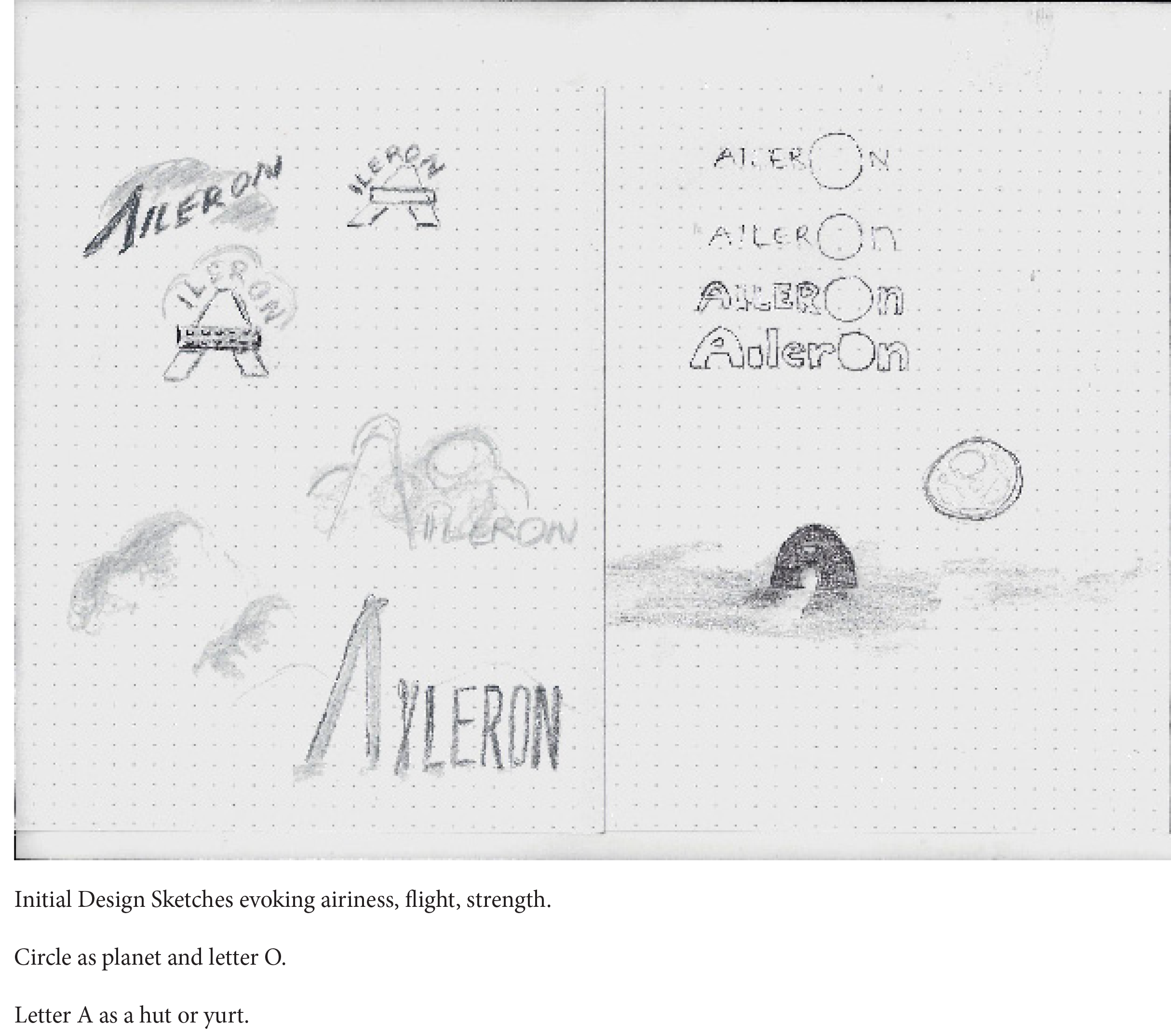
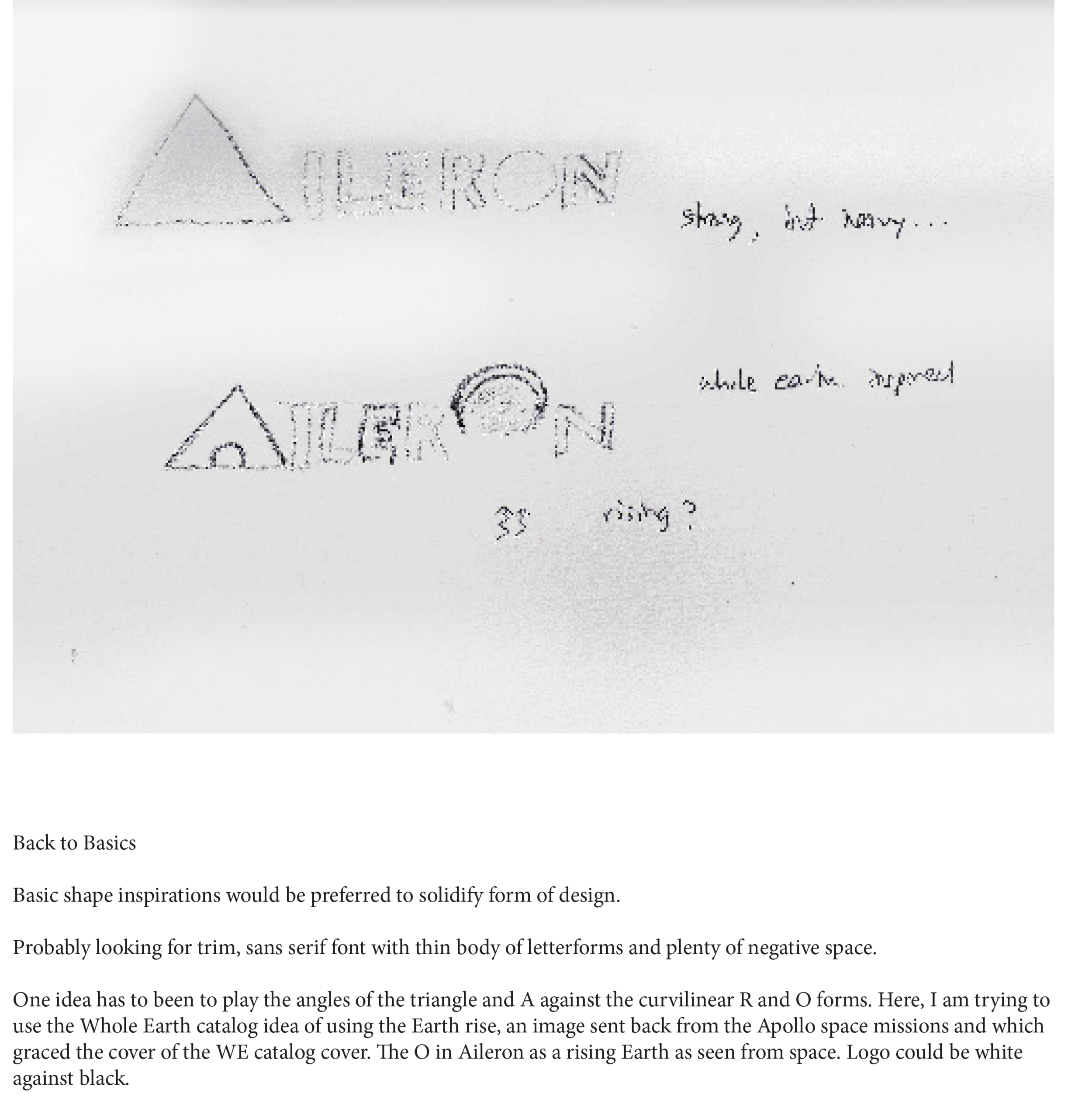
Notebook entries and thumbnails for logo and logotype design.
Ideation
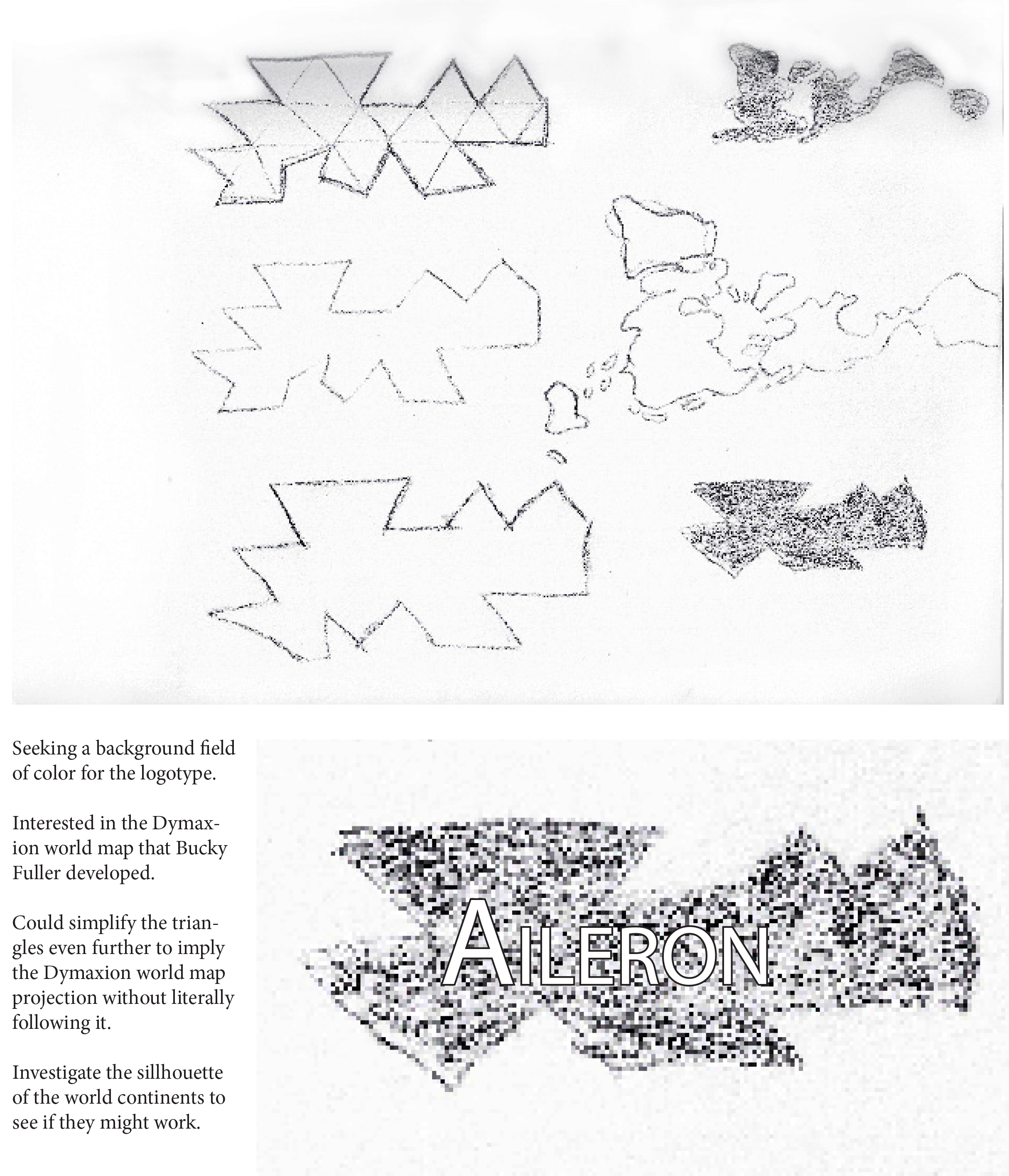
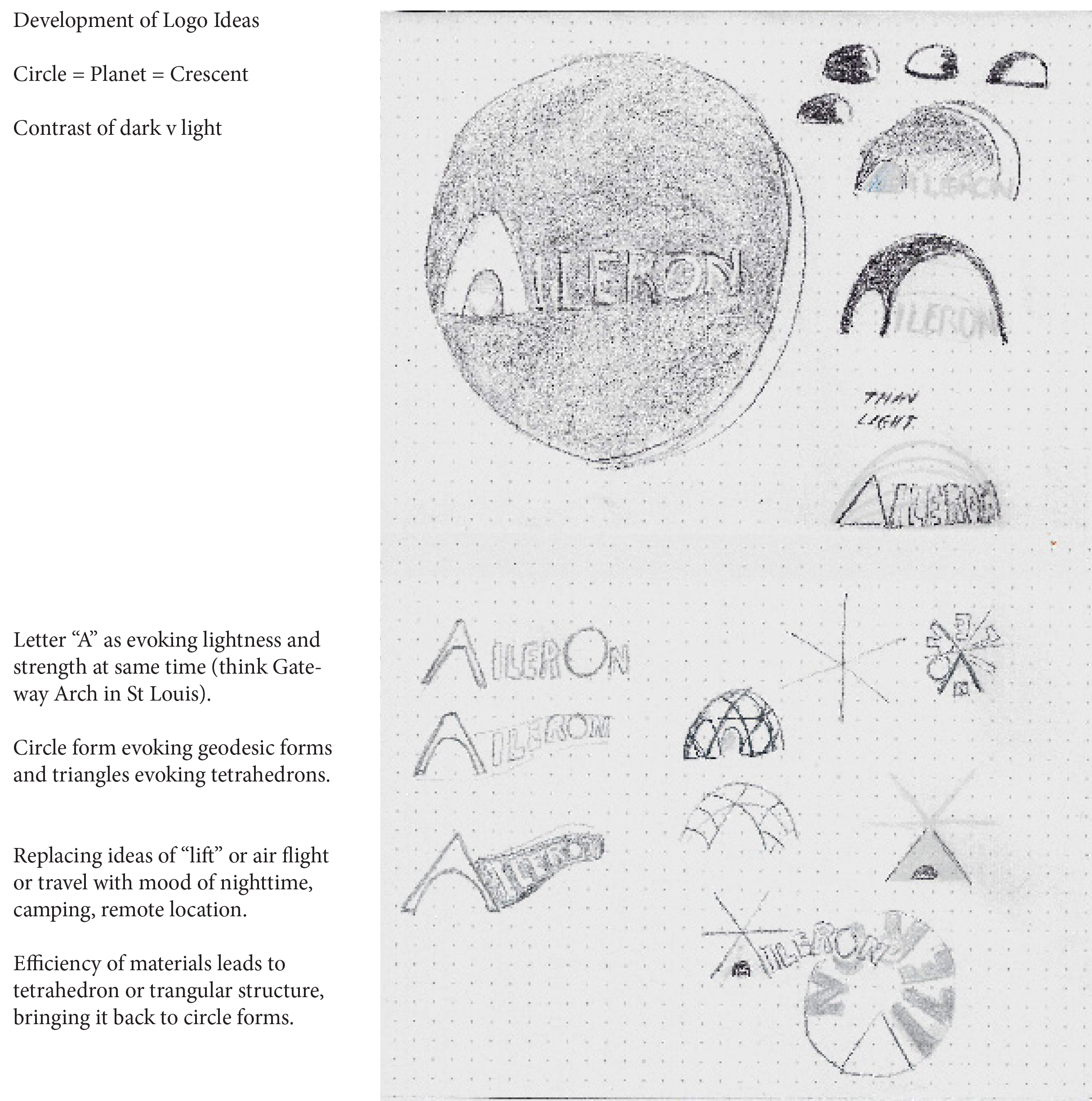
Through thumbnails and sketches, a melding of the sources—exhibition catalogues of museum shows about Buckminster Fuller, books by the famous designer and engineer, and contemplation of the company’s Mission Statement, ideas
begin to take shape on the written page. You can’t beat a
pencil for flexibility, speed, and iterations of even the wildest ideas or variation.
Execution
Identity Package for Aileron corp, a backcountry equipment company.
The final form of the logo and logotype for Aileron express
the ethics and mission of the company: cleanliness, purity of form, a positive view of the world and nature, futurism, modernism, and efficiency.
Process: Roots of the design
Paper
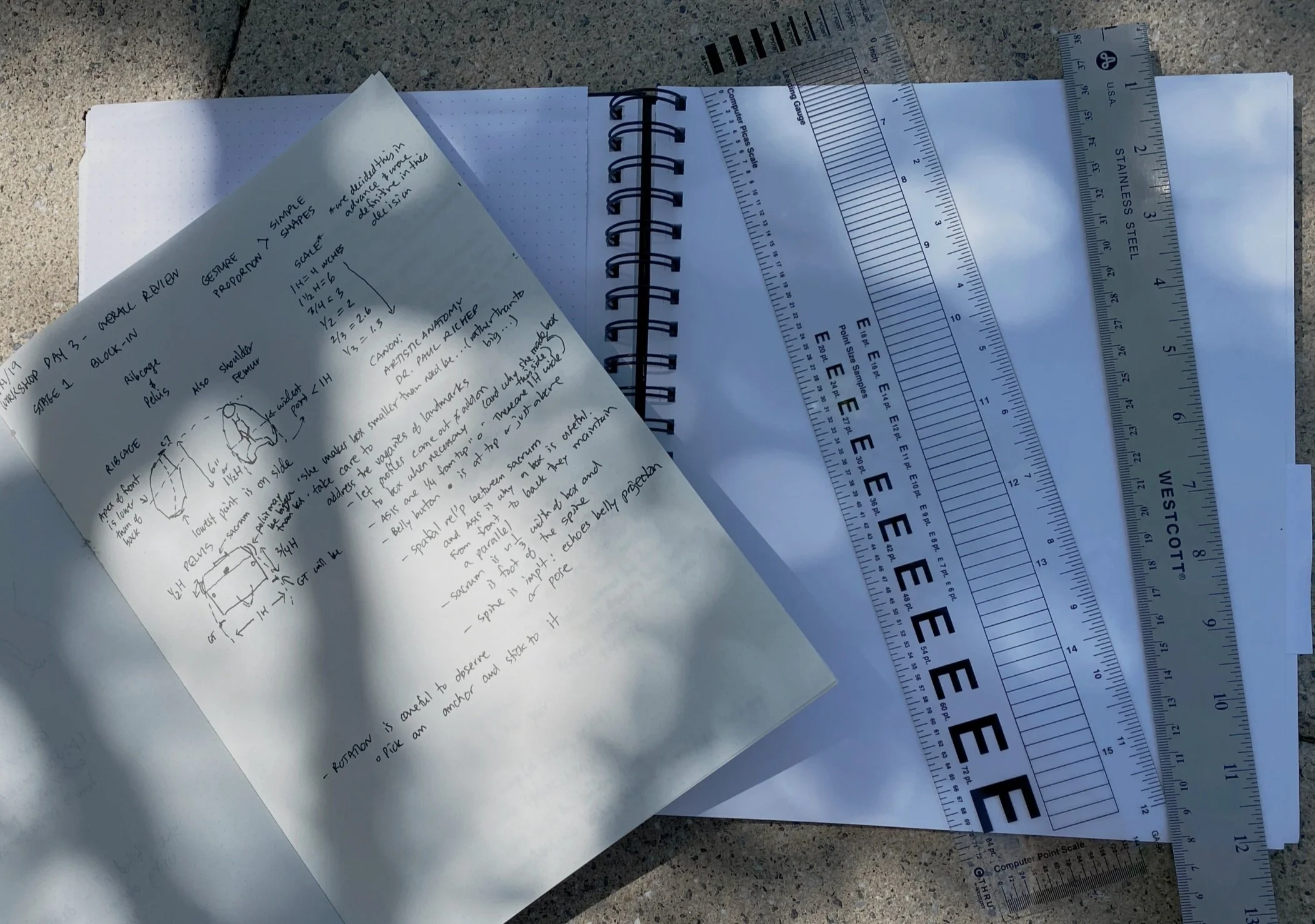
Once the research is done, then notebooks, dot pads, watercolor books, even lined paper are my starting point.
Pencil
The best tool for visualization yet invented: What’s not to like about pencils and physical media?
Pen
Color: I have always been a very color sensitized person, and I look forward to bringing color opportunities to the designs that I face.
Design Explorations
Journal entries, sketches, and early drafts lead digital iterations, and finally to the core style of an identity package (logo, logotype, typefaces, and color palette).





Corporate Typefaces for Aileron are Century Gothic and the unusual monospace Courier New, for body text in certain situations. The company founders—engineers at heart—wanted to maintain a “Geek Chic” connection to Buckminster Fuller, whose dark, heavy-frame glasses and ethos of the brainy intellectual, were almost as influential as his archetypal geodesic dome (Geodesics are trans-ocean transits or shipping lines that marine navigators—a field where Buckminster Fuller got his start, in the US Navy—use to find the quickest and most efficient ways across the bright blue marble of the Earth.)
Aileron Project Images and Work
For the images below, the Poster Design is for a movie night fundraiser, hosted by the client company, Aileron. (The illustration of the maid in the mountain is not my work, attributable to a Japanese manga cover artist to be credited.) The poster design is inspired by Art Deco design principles, including bringing together straight lines and gently curving shapes, and using spare, modernized typeface. The colors for the poster are drawn from the corporate colors for the company’s identity.All the Photography in the websites below is credited to me, Craig Charnley. The digital sketch of the mountain skyline, used as a footer for web pages in the project, is one that I drew for the project in Photoshop.


