A New Way of Looking at an Old Festival
Gilroy Garlic Festival
Event Promotion,
Publication Design,
Advertising and Brand
Target Audience:
Families and all ages ranging youth through seniors (7 – 75). Hope is to continue to attract mainstay festival-goers and foodies, and to continue to attract new people in the 18-30 age categories by making authentic, crafted tradition a sellable quality of the event.
Background
The Gilroy Garlic Festival—a multi-day, outdoor event and cultural spectacle—has been running for almost 50 years and is a mecca event for those who love garlic. The event regularly draws 100,000 people over three days each summer, and some are concerned that the trend towards media and electronics, and away from live event participation, may see a drop-off in attendance.
Design Problem
The Festival has been going on for decades, but many do not know that Gilroy was a historically important stage and horse team turnover site in the stagecoach lines that ran up El Camino Real from Monterey to points North. City leaders want to harken back to the California roots and expand the tent of those who might attend, promising warm, family-friendly entertainment and a wholesome day in the sun.
Process: Research
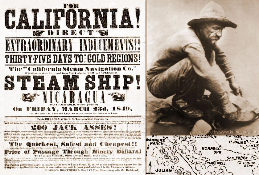
I looked up old newspapers online and in museums of the West, visiting sites like the Berkeley University historical library and museums of history in towns like Santa Fe and Steamboat Springs, or the San Francisco Library (pictured here). Typefaces, type layout, color choices, and overall whimsical design became part of a language of images and colors that I brought to the design of the event’s materials. Sketches, downloads of images, and drafts of variations all played a part before moving into more finished digital versions.
Frequently my search includes trips to the library.
Research
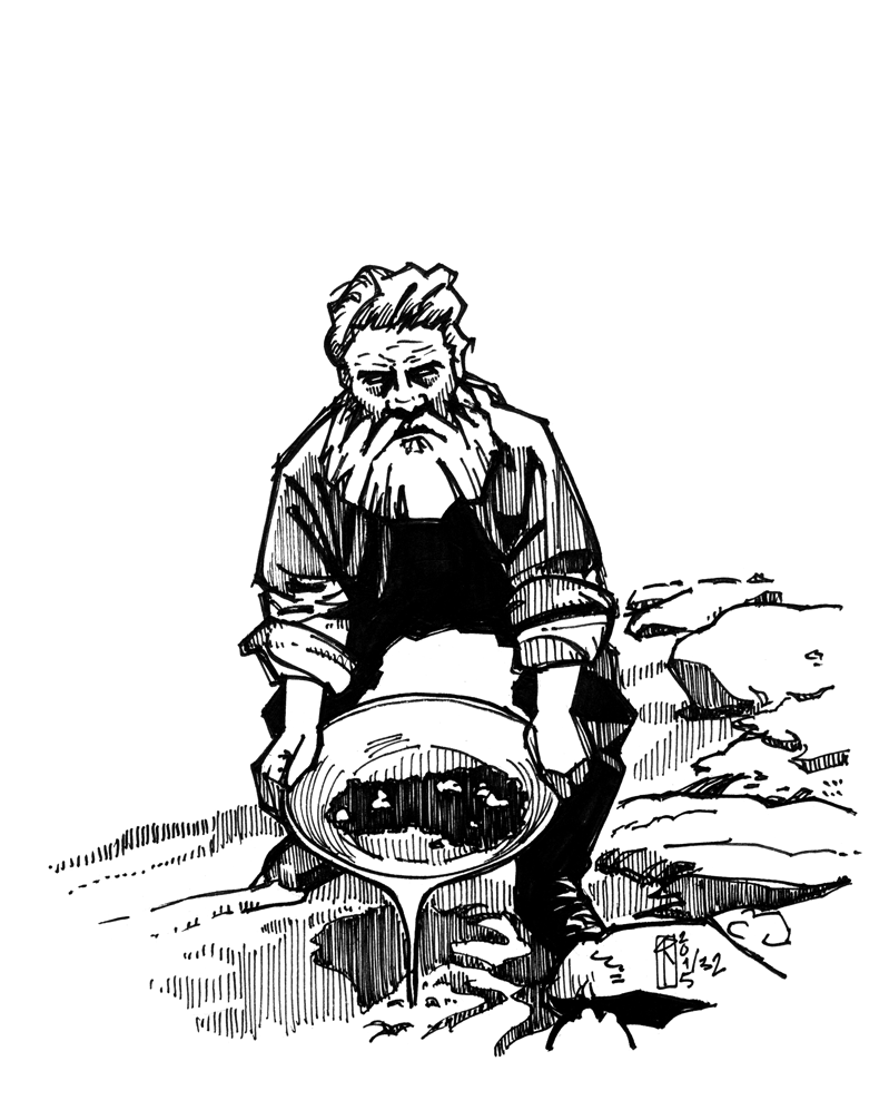
For look and feel I looked to California in the 1800s.
Concept
Initial thumbnails and concept sketches in pencil.
Sketch
Design Solution:
Historically referential pieces were built on the known tropes of California history as well as the use of design elements from the early days of print journalism that coincided with California’s first 50 years of statehood.
A hand-made “GARLIC” typeface, created especially for the Gilroy Garlic Festival was wedded to existing woodblock and other poster type, historical typefaces, adopting an “anti-unified” style-set, mimicking the broadsheet papers and handout flyers of the mid to late nineteenth century, when promoters hawked transcontinental travel and journeys by ship through the isthmus of Panama or across El Salvador as the newly won territory of the California coast was developed.
The tone of the communications was urgent, almost histrionic, almost inexplicable to us today for all of its jangly hyperbole and circus barker noise. Based on rather staid and middle-of-the-road, prior designs I had seen for the event, I wanted to go back, to these old roots, and find there something new to help them draw in new customers and refresh their regular base.
A choice was made to represent the Gilroy Garlic Festival logo and all promotion materials with a unity of style, including typeface and icon art, played against an aged paper texture. A handbill style map, two-sided, four-folded 11”x17” in format, bears the poster design on one side, a map on the other, with event details laid out in text for the fairgoers. Billboards will attract and remind drivers on the 101 Highway, which passes nearby, posters announce the event, and a mobile navigation app will assist those attending in navigating around the location at Christmas Hill Park.
Research Sources and Early Drafts


Design Projects
Outdoor Advertising
Bulletin format Billboard Design.
I had fun making the mockup myself in Photoshop, from a billboard in L.A. that featured a comic picture of Ellen de Generes, one that Matt Lauer (then of the Today Show) had put up during a feud with the comic.
Event Poster Design
Poster Design - A Journey
This is an iteration that includes augmentations, such as texture layer styles, revised use of historically appropriate typeface Clarendon as part of an improved logotype, and use of a layout grid to properly displace elements and organize negative space.
Design Iterations
Original design and layout.
Original Concept
Latina woman illustration and revised logotype. Design moves closer to inclusion in principle.
Revision & Additions
Revised layout, texture, logo, and scale of elements.
Execution
Execution and Further Designs
Below is a carousel slideshow of images and designs made for the project: event flyer design, map for event, publication design, and a novel navigation mobile app concept. (Scroll left or right to view the entire image set.)


